 ×
×
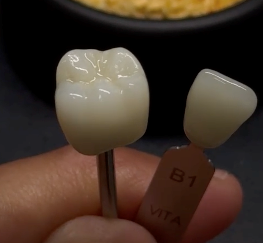
A multilayer crown against its target B1 tab — where the gradient should flow seamlessly from neck to edge.
Look at the restoration above, held next to its target shade. A good multilayer crown should flow — a warmer, more chromatic neck melting seamlessly into a lighter, more translucent edge, exactly the way light travels through a natural tooth. But sometimes, after sintering, the flow breaks. A hard band appears where there should be a blend. The transition lands in the wrong place. Or the whole gradient goes flat and muddy, reading like a single dull shade rather than living depth.
“Poor colour transition” is one of the more frustrating problems with semi-transparent zirconia, precisely because the material is capable of so much better. As someone on the manufacturing side, I want to explain why the gradient fails — because the cause is almost never a single mistake, and knowing where to look turns guesswork into a quick diagnosis.
What a multilayer block is actually doing
Here’s the point that gets overlooked: *a multilayer block isn’t just a colour gradient — it’s a coordinated colour and translucency gradient.*
A natural tooth is chromatic and comparatively opaque at the cervical, where dentin dominates, and it becomes lighter and far more translucent toward the incisal edge, where enamel takes over. A well-designed block builds both of these gradients into its height at once, so that as you move up the restoration, chroma falls and translucency rises together. When those two gradients move in step, the eye reads a living tooth. When they drift out of step, it reads as artificial.
This is also why “semi-transparent” — high-translucency — grades are the least forgiving. With less masking opacity to hide behind, every flaw in the transition is on full display. The very translucency that makes these blocks beautiful is what makes a bad gradient so obvious.
Name the signature first
Before adjusting anything, decide which of three failures you’re actually looking at.
The gradient seen within the material itself — chroma and translucency shifting across the height of the block.
A visible hard line or band — a step where colour or translucency jumps rather than blends — is a blending problem. The transition between layers is too abrupt.
A transition sitting in the wrong place — the “enamel” zone creeping down onto the gingival third, or the chroma bunched too high — is a positioning problem. The gradient itself is fine; it simply landed at the wrong height on the tooth.
A washed-out, muddy transition with no definition at all is a thickness or sintering problem. The gradient is there, but it isn’t reading.
These point to completely different causes, and they split — as always — into what the block brings and what the workflow does with it.
What the block brings to the table
This is where manufacturing quality lives.
Gradient architecture. Older three- or four-layer blocks stack distinct bands of colour, and the interfaces between them can show as visible steps. Continuous-gradient technology blends chroma and translucency progressively across the whole height, with wide transition zones that hide their own boundaries. The number and width of those blending zones is a direct measure of how seamless a block can be.
Coordination of colour and translucency. The two gradients have to move together. If chroma fades faster than translucency rises — or the reverse — the transition looks unnatural even when each gradient, on its own, is perfect. Getting them to track each other across the block is one of the harder things we do.
Layer consistency and controlled interlayer blending. The transition zones need to remain consistent in every block, with pigments evenly dispersed and powder layers blended in a controlled way. The goal is to create a smooth optical transition, not a sharp mechanical boundary that may become visible after sintering. A block that is consistent from top to bottom, and from batch to batch, is what lets a technician trust their nesting decisions.
What the process does with it
Even an excellent block can lose its gradient in the workflow.
Nesting and positioning in CAD. This is often the biggest lab-side lever, and the most common cause of a mislocated transition. The restoration has to be placed within the virtual block so the gradient falls at anatomically correct heights. Set it too high or too low and the enamel zone ends up on the neck; tilt it and the whole gradient compresses on one side and stretches on the other. Careful vertical positioning and angulation solve most “wrong-place” transitions before milling ever starts.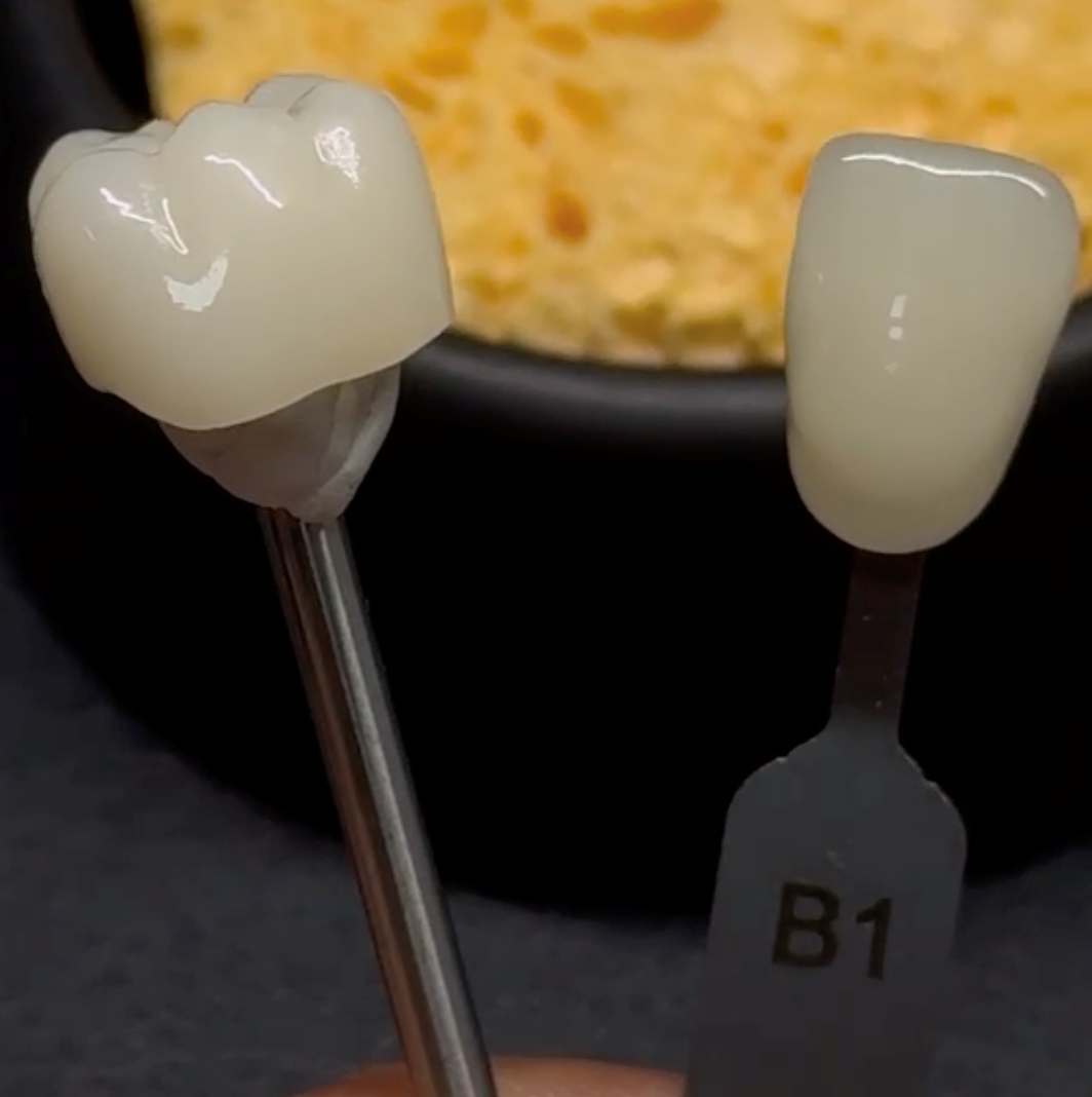
The same principle at the chairside check: how the finished gradient reads against the reference tab.
Sintering. Temperature and schedule shift translucency — most strongly in the incisal layer — and can subtly diffuse pigment across the interfaces. An off-target firing can either exaggerate the contrast between zones or flatten it into that muddy, washed-out look. Validated parameters keep the gradient reading the way it was designed to.
Finishing. Over-reduction is a quiet gradient-killer, especially in thin restorations and veneers. Grind too deeply and you cut through one layer into the next, exposing a colour that was never meant to be on the surface — an instant, artificial-looking band. In thin sections, the gradient also simply reads with less depth, so heavy adjustment costs more than it appears to.
The takeaway
A poor colour transition does not automatically mean the material failed. It means one link — gradient architecture, the coordination of colour and translucency, nesting position, sintering, or finishing — slipped out of alignment. Name the signature first: hard line, wrong place, or washed out. From there the cause narrows quickly.
That’s the perspective I try to bring as a manufacturer: to build blocks whose gradients are wide, consistent, and forgiving, to document how to position and fire them, and to stand beside the technician when a case doesn’t flow the way it should. A seamless transition is a partnership between a well-made block and a well-planned workflow. For manufacturers, this means controlling not only shade and translucency, but also how those properties change gradually through the height of the disc.


 EN
EN

